Wanderlift
Date
2016 - 2018
categories
Marketplace, Ridesharing, Mobile
role
Co-founder, COO, Head of Design
reading time
collaborators


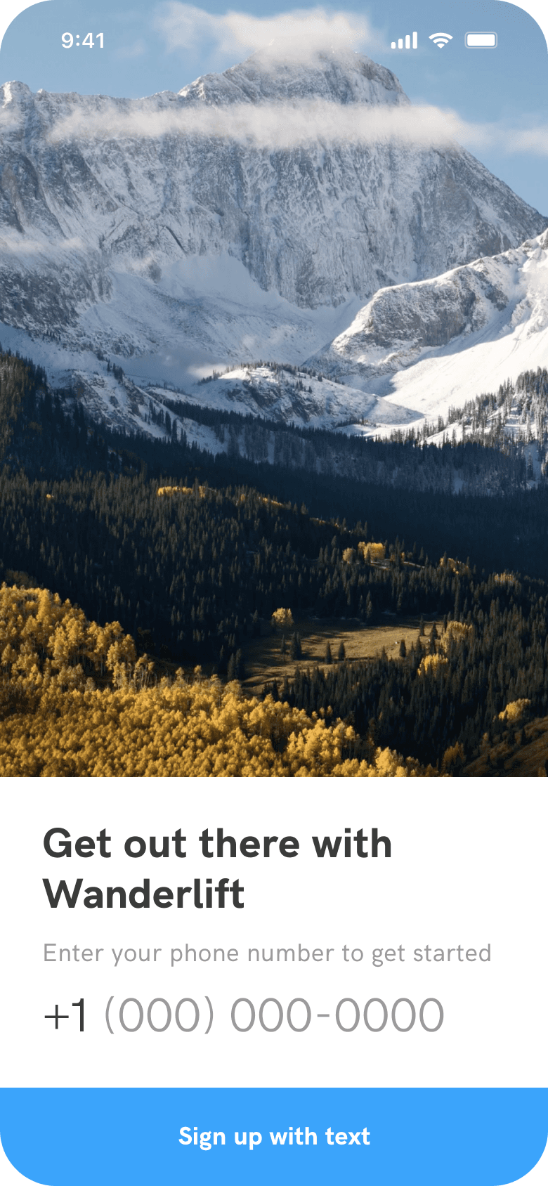

Wanderlift is a startup founded by two University of Denver students that were frustrated that they couldn't get to the Rocky Mountains without a car. I joined the founding team to catalyze their mission with a complete brand, marketing, and app overhaul.
Redesigning the MVP
While the MVP app set the tone for the brand, homogeneous text hierarchy and some lengthy user flows made it difficult to navigate.
When I joined the founding team, two of my cofounders were already well-underway with an initial iOS version of their app. This version of the app was the initial product we launched in the Fall of 2016. From a design perspective, it emphasized photography by first displaying the end-location in a full-screen square card.
Users could then tap on a card to view available rides to the location, and then dig-deeper into the flow to arrive at the ride they wanted. This original design was a good start, but lacked typographic hierarchy, scaleable UX decisions, and some key features like the ability for riders to request rides or for drivers to be able to view their payout information.
Screen depth refinement
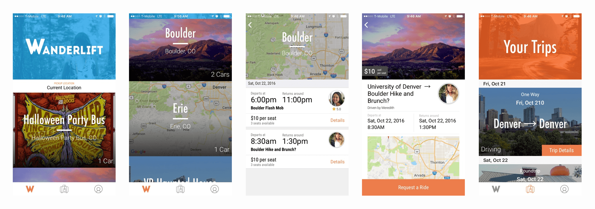
The redesign addressed some key typographic and brand issues, but the most significant improvement was a reduction in screens by half.

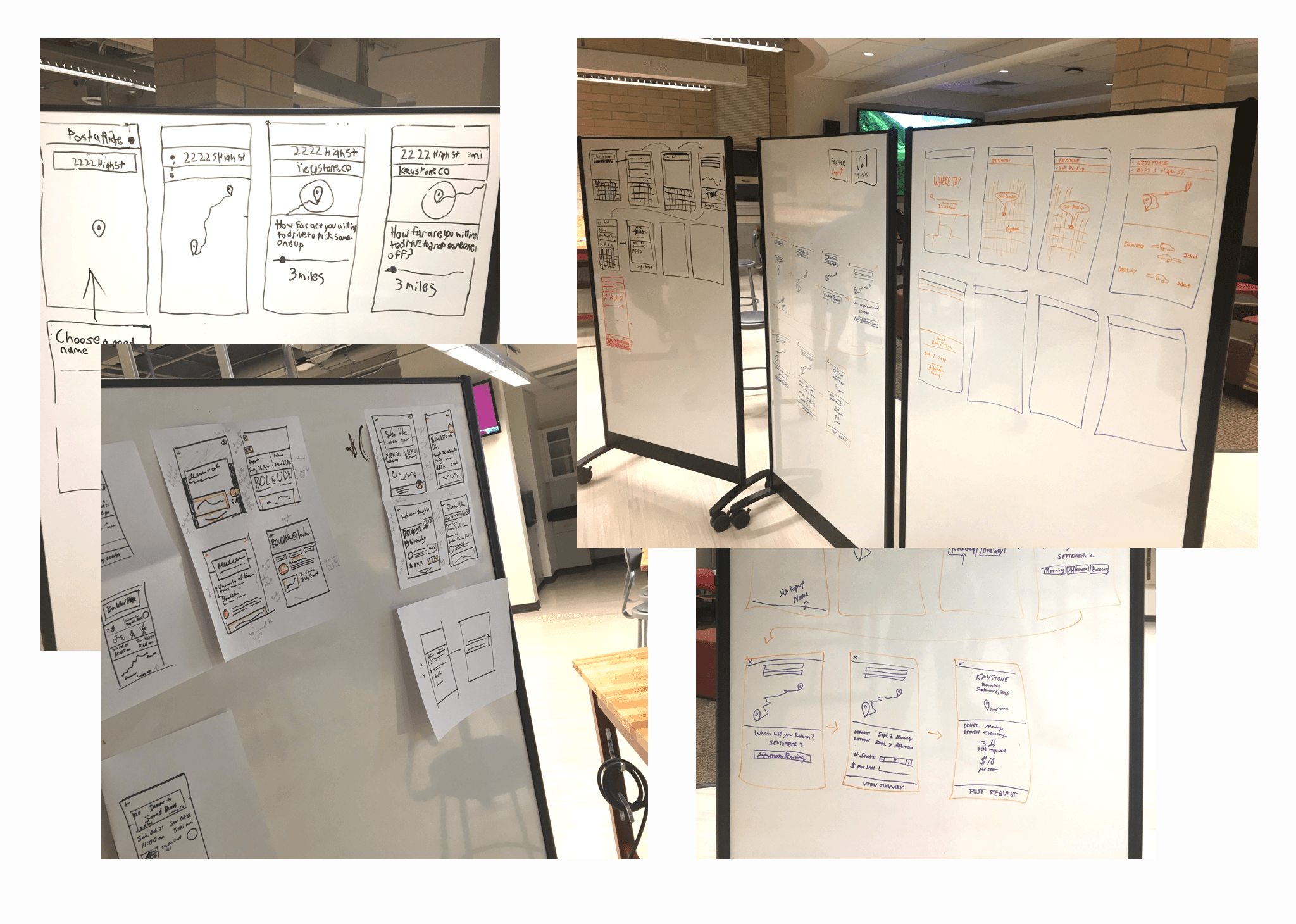
About halfway through Fall quarter, the team decided that we would spend a week in December redesigning and rebuilding the app on React for both iOS and Android users. Below are the user flows for the first and second versions of the app. Note the reduction in depth from the first version to the latest, as we were able to condense and insert features that would make the marketplace a smoother experience. The macro view will give you the best perspective on how much we were able to refine the experience down for the new product.
The most dramatic improvement was compressing the lengthy post a ride flow into just one screen, regardless of whether the ride would be one-way or round-trip. Also notice that we were able to reduce the core navigation to just two screens without limiting the ability of a user to exit a process quickly, and without a traditional iOS tab bar. The primary black blocks on the left of the flows show the core screens in the app that the rest of the interactions stem from. These would traditionally represent tabs in an iOS app, but we were trying to make it as platform-neutral as possible.

We experimented with an immense variety of layouts inspired by other apps, competitors, and marketplaces. We ran a design sprint to weigh typography, visuals, and information hierarchy to condense the key screens of the app into a more glanceable interface.

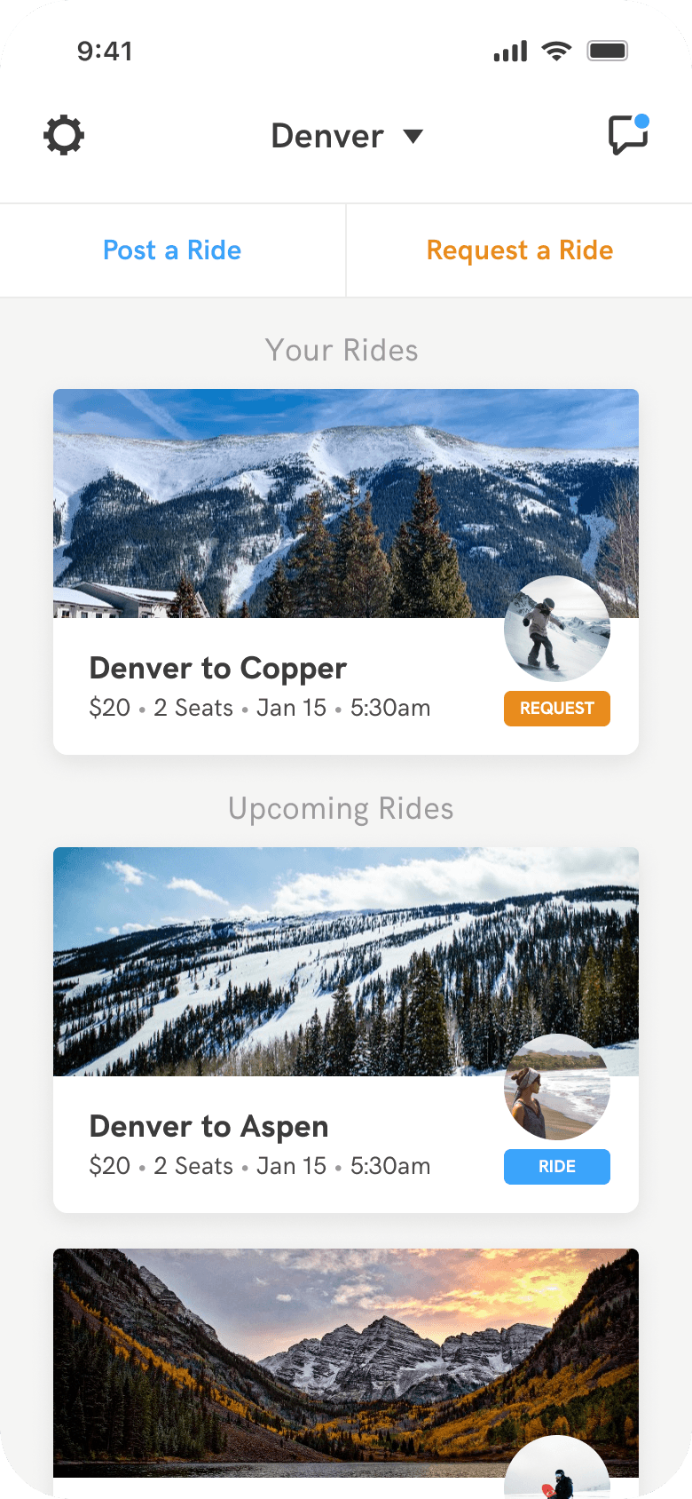
The final design
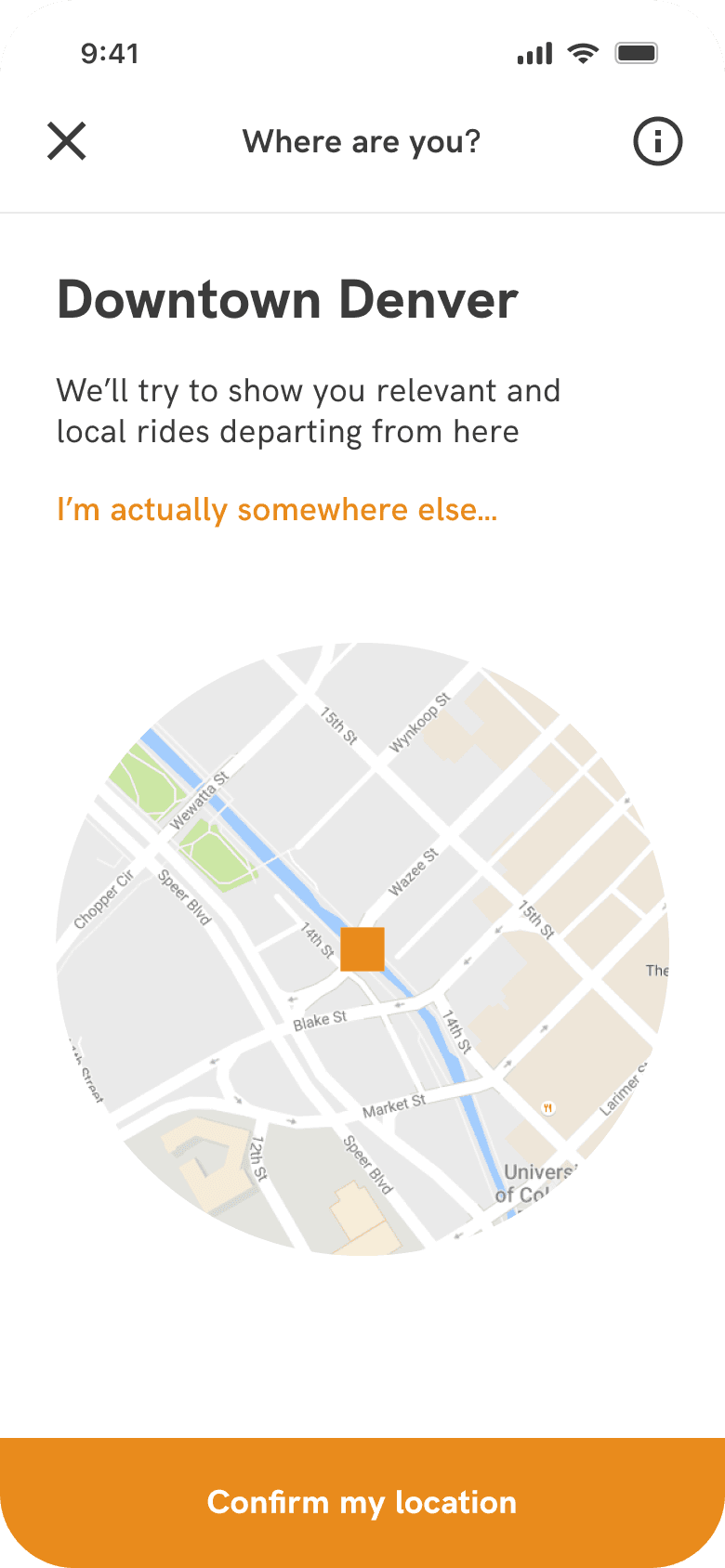
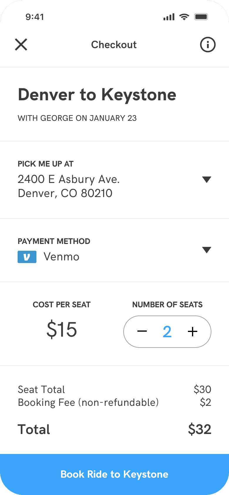
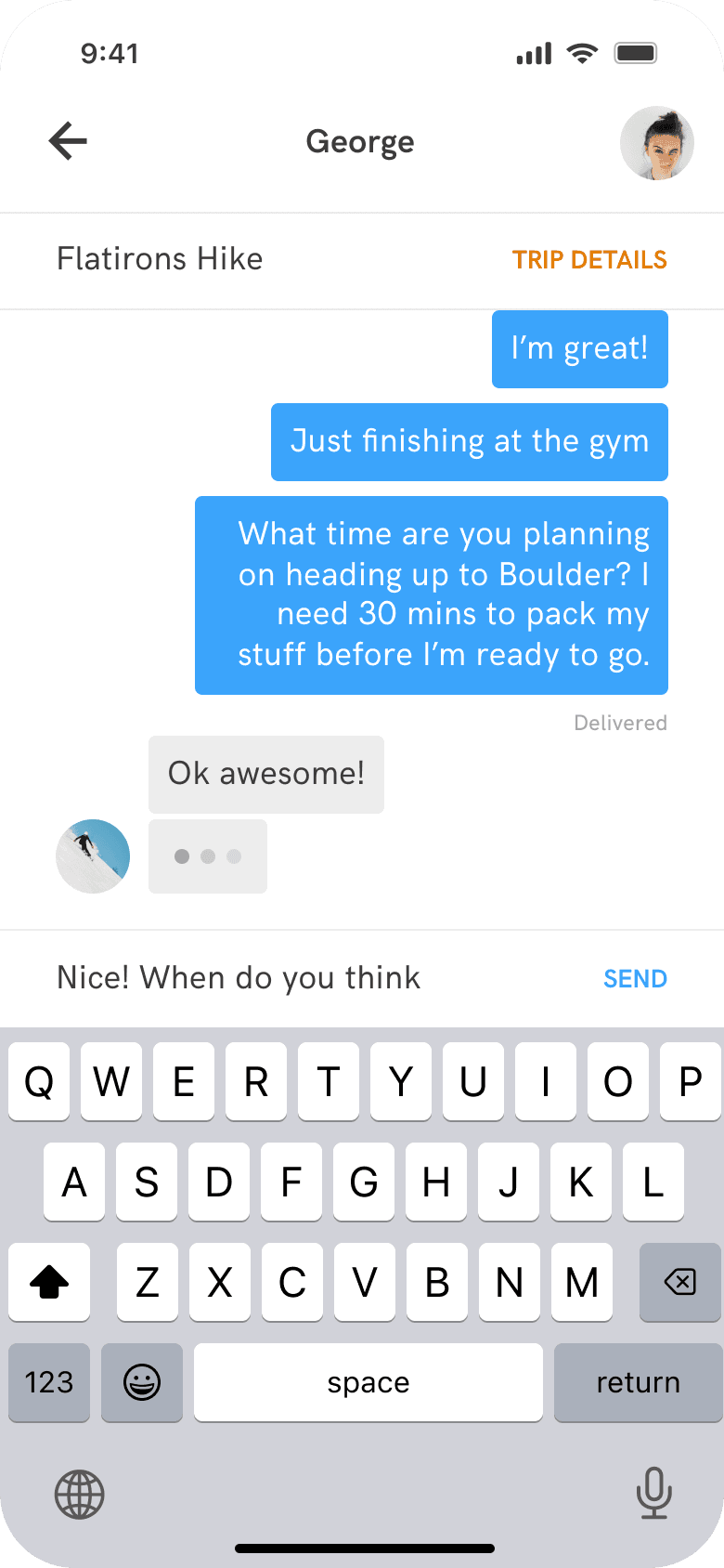
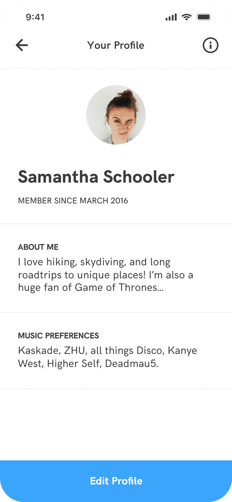
A cohesive visual language and standardized typographic system made a strong, reputable, and scalable interface. Subtle use of brand color simplified the call to action for both drivers and riders, and pointed both users in the right direction depending on how they planned on using the app today.
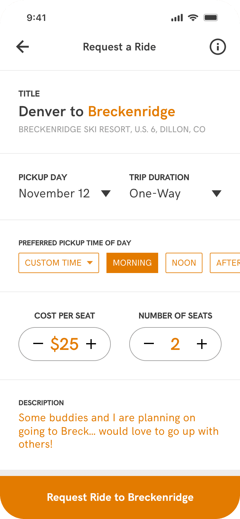
The end result combined careful planning, legibility testing, user feedback, scalability testing, and hours of prototyping. As mentioned earlier, one of the crowning achievements of the redesign was reducing the ride posting sequence down to one screen. Splitting some of the smaller components into half-screen options pushed the available information closer to the top, and the introduction of label-button components that horizontally scrolled shaved away the unnecessary interaction of choosing available options from a dropdown and confirming.
Label-buttons also had the added benefit of indicating availability, and automatically updated based on the timeline, so if you selected an earlier time in the day, only the later options were selectable for the return option. Another key UX component was the incrementation fields. A user could either tap the respective plus or minus icons, or tap the central number to type in a value. In sum, the features implemented in the redesign intuitively covered a vast number of use cases, encouraged key interactions, all while robustly accommodating other scenarios.
Beyond the app, we used illustration and art to make it the intense adventure brand we knew our users would resonate with.
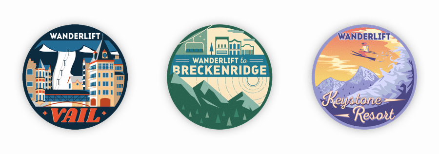
Marketing was key to the success of the app, and the brand was substantial enough to prompt Zipcar to reach out to us inquiring about a partnership. Strong messaging on our posters and bold colors solidified Wanderlift’s reputation as the cool, fit, spontaneous, and amiable buddy everyone wanted to be friends with. The college crowd was easy to entice with the FOMO copy we had, but we didn’t want to isolate the rest of our market, so we drew-up some stylized thematic stickers for a few of the popular mountains our users indicated during some market research.
We were inspired by classical swiss ski posters from the 1940’s and 50’s and aimed to blend their stylistic elements with modern geometries. The stickers were a huge hit with the full spectrum of our market, as the older crowd leaned towards the classier Vail sticker and the younger crowd picked up more of the Keystone stickers. The size was perfect: small enough for laptops, water bottles, and accessories, but large enough to still show off the detail in the artwork.

© Daniel R Farrell 2023 • All rights reserved
The seconds of your life are
T
i
c
k
i
n
g
away
Wanderlift is a startup founded by two University of Denver students that were frustrated that they couldn't get to the Rocky Mountains without a car. I joined the founding team to catalyze their mission with a complete brand, marketing, and app overhaul.
Redesigning the MVP
While the MVP app set the tone for the brand, homogeneous text hierarchy and some lengthy user flows made it difficult to navigate.
When I joined the founding team, two of my cofounders were already well-underway with an initial iOS version of their app. This version of the app was the initial product we launched in the Fall of 2016. From a design perspective, it emphasized photography by first displaying the end-location in a full-screen square card.
Users could then tap on a card to view available rides to the location, and then dig-deeper into the flow to arrive at the ride they wanted. This original design was a good start, but lacked typographic hierarchy, scaleable UX decisions, and some key features like the ability for riders to request rides or for drivers to be able to view their payout information.
Screen depth refinement
The redesign addressed some key typographic and brand issues, but the most significant improvement was a reduction in screens by half.
About halfway through Fall quarter, the team decided that we would spend a week in December redesigning and rebuilding the app on React for both iOS and Android users. Below are the user flows for the first and second versions of the app. Note the reduction in depth from the first version to the latest, as we were able to condense and insert features that would make the marketplace a smoother experience. The macro view will give you the best perspective on how much we were able to refine the experience down for the new product.
The most dramatic improvement was compressing the lengthy post a ride flow into just one screen, regardless of whether the ride would be one-way or round-trip. Also notice that we were able to reduce the core navigation to just two screens without limiting the ability of a user to exit a process quickly, and without a traditional iOS tab bar. The primary black blocks on the left of the flows show the core screens in the app that the rest of the interactions stem from. These would traditionally represent tabs in an iOS app, but we were trying to make it as platform-neutral as possible.
We experimented with an immense variety of layouts inspired by other apps, competitors, and marketplaces. We ran a design sprint to weigh typography, visuals, and information hierarchy to condense the key screens of the app into a more glanceable interface.
The final design
A cohesive visual language and standardized typographic system made a strong, reputable, and scalable interface. Subtle use of brand color simplified the call to action for both drivers and riders, and pointed both users in the right direction depending on how they planned on using the app today.
The end result combined careful planning, legibility testing, user feedback, scalability testing, and hours of prototyping. As mentioned earlier, one of the crowning achievements of the redesign was reducing the ride posting sequence down to one screen. Splitting some of the smaller components into half-screen options pushed the available information closer to the top, and the introduction of label-button components that horizontally scrolled shaved away the unnecessary interaction of choosing available options from a dropdown and confirming.
Label-buttons also had the added benefit of indicating availability, and automatically updated based on the timeline, so if you selected an earlier time in the day, only the later options were selectable for the return option. Another key UX component was the incrementation fields. A user could either tap the respective plus or minus icons, or tap the central number to type in a value. In sum, the features implemented in the redesign intuitively covered a vast number of use cases, encouraged key interactions, all while robustly accommodating other scenarios.
Beyond the app, we used illustration and art to make it the intense adventure brand we knew our users would resonate with.
Marketing was key to the success of the app, and the brand was substantial enough to prompt Zipcar to reach out to us inquiring about a partnership. Strong messaging on our posters and bold colors solidified Wanderlift’s reputation as the cool, fit, spontaneous, and amiable buddy everyone wanted to be friends with. The college crowd was easy to entice with the FOMO copy we had, but we didn’t want to isolate the rest of our market, so we drew-up some stylized thematic stickers for a few of the popular mountains our users indicated during some market research.
We were inspired by classical swiss ski posters from the 1940’s and 50’s and aimed to blend their stylistic elements with modern geometries. The stickers were a huge hit with the full spectrum of our market, as the older crowd leaned towards the classier Vail sticker and the younger crowd picked up more of the Keystone stickers. The size was perfect: small enough for laptops, water bottles, and accessories, but large enough to still show off the detail in the artwork.
© Daniel R Farrell 2023 • All rights reserved
The seconds of your life are
T
i
c
k
i
n
g
away