Garage sale app
Date
2018
categories
Marketplace, Mobile
role
Product Designer
reading time
This is a concept Garage Sale app experience that makes it easier for sellers to intelligently inventory their goods, and bargain hunters to find what they're looking for.
Starting with writing
Before diving-in, I like to ideate all of the questions, thoughts, and areas of opportunity to explore with the design.
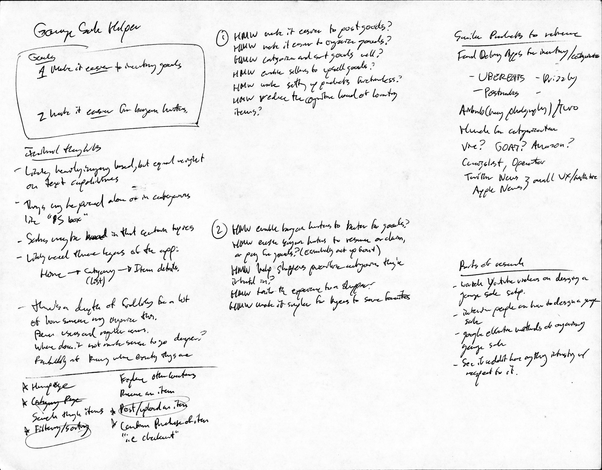
The best design solves for as many opportunities as possible while laying the foundation for more features to come in the future of the product, so I took the two sides of the prompt and broke them into how might we? (HMW) statements to begin identifying questions I could try to answer in implementation.
On the right side of my notes, you’ll see I wrote out a couple of research points and opportunities to start to wrap my mind around both the problem, as well as potential places of inspiration all the way from vaguely similar to wildly different app interfaces.
I called up a friend to get a fresh perspective on the challenge and to dig into some my assumptions on what would be most important to solve with this app.

I find that I do my most effective work when I can verbally discuss concepts, assumptions, and problems with someone else, especially if they’re not a designer. A quick 15 minute call with my friend Grace brought up some great points from both the buyer and seller perspective, as she reminded me of a couple of key components of a garage sale. First, garage sales are very casual. We discussed how the primary goal of a garage sale is to get rid of stuff, and maybe make a little extra cash off of what a seller is trying to get rid of. “If you wanted to actually make a profit off of something, you’d have better luck on craigslist” Grace told me, drawing the boundary between what a craiglist experience is vs. a real garage sale experience.
Second, the fidelity of an item post needs to cater to just how much work the seller wants to put into selling an item. Some users will be fanatic about every detail, while others will have too much stuff to properly inventory it all. Third, cataloguing every item is extremely tedious, and a lot of times there is varying scope in how someone is trying to sell something. It’s not infrequent to see people just toss things in a box with a price tag on the outside so they’re not taking explicit inventory of it all. Whatever inventory interface I design will have to accommodate for the varying levels of commitment to the process on the seller side.
What do garage sale experts (garage salers?) do to ensure success, and what existing design patterns could help facilitate a marketplace? I did some research into how power-users might already be thinking about organizing their garage sales.

When I go through inspiration I try to point-out features or styles that are functionally or visually interesting and may lend themselves to unique UX patterns that are still intuitive and engaging.

My initial search on Google confirmed most of the assumptions I was making on how people categorize and price things: depending on how dedicated the experts are to a particular niche of items, there are a handful of strategies they use to simplify or highlight items. A lot of the guides talked about more of the physical implementation of the garage sale that may be outside of a strong value-add for an app, but there were still some great points about how people should approach pricing with respect to the expectation of bartering, as well as addressing the cognitive overhead of keeping track of items when the goal is largely to get rid of things that take up space.
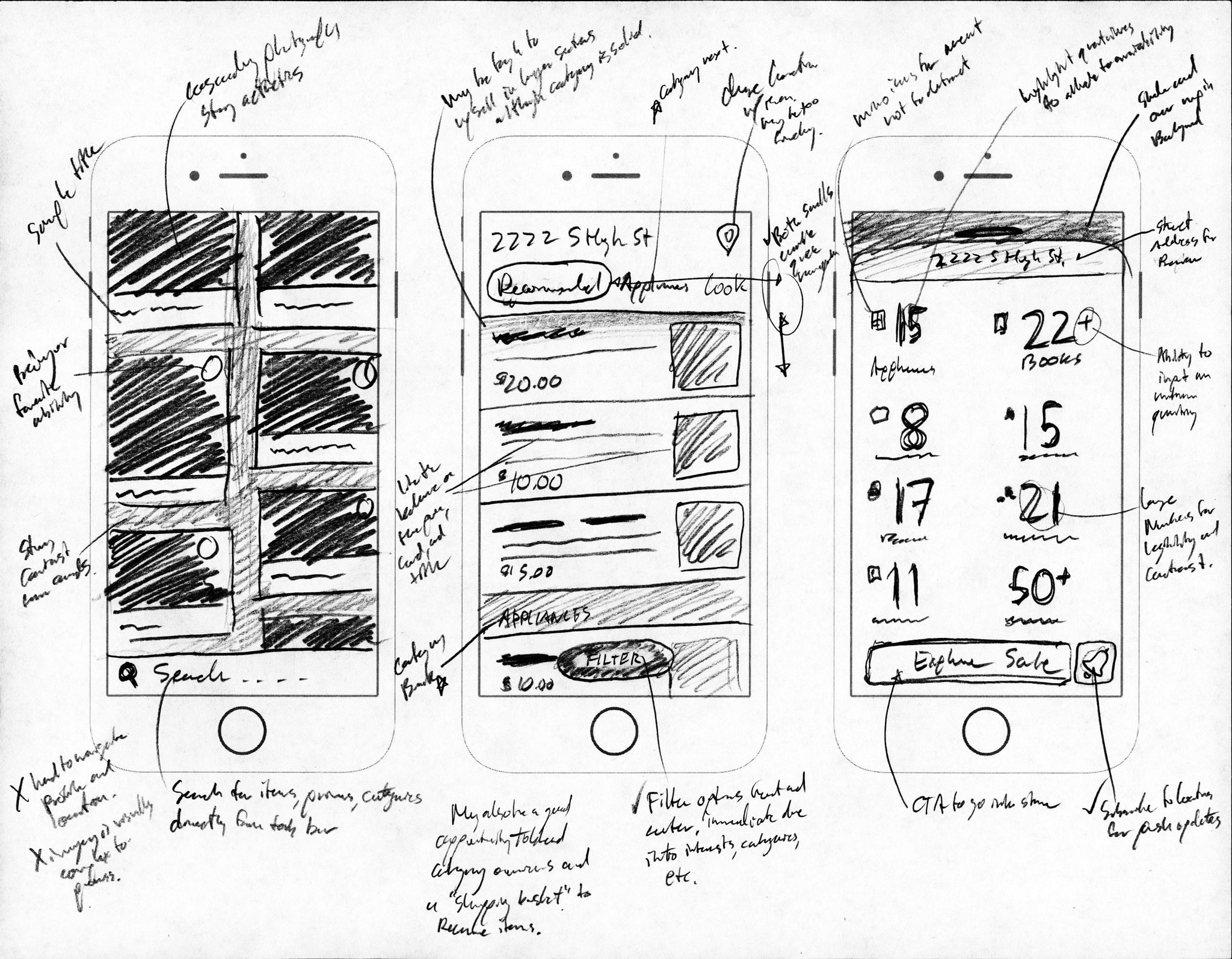
On the product side, I put together a Dribbble bucket of visual and UX options that I liked, and placed the options into a large artboard alongside some screenshots of apps I have on my phone to identify patterns I could use. You'll see that I label patterns that could work well for my final solution.
Ultra-low fidelity sketching is a great way to test a variety of patterns against one-another while weighing the weaknesses, opportunities and relationships of certain combos.
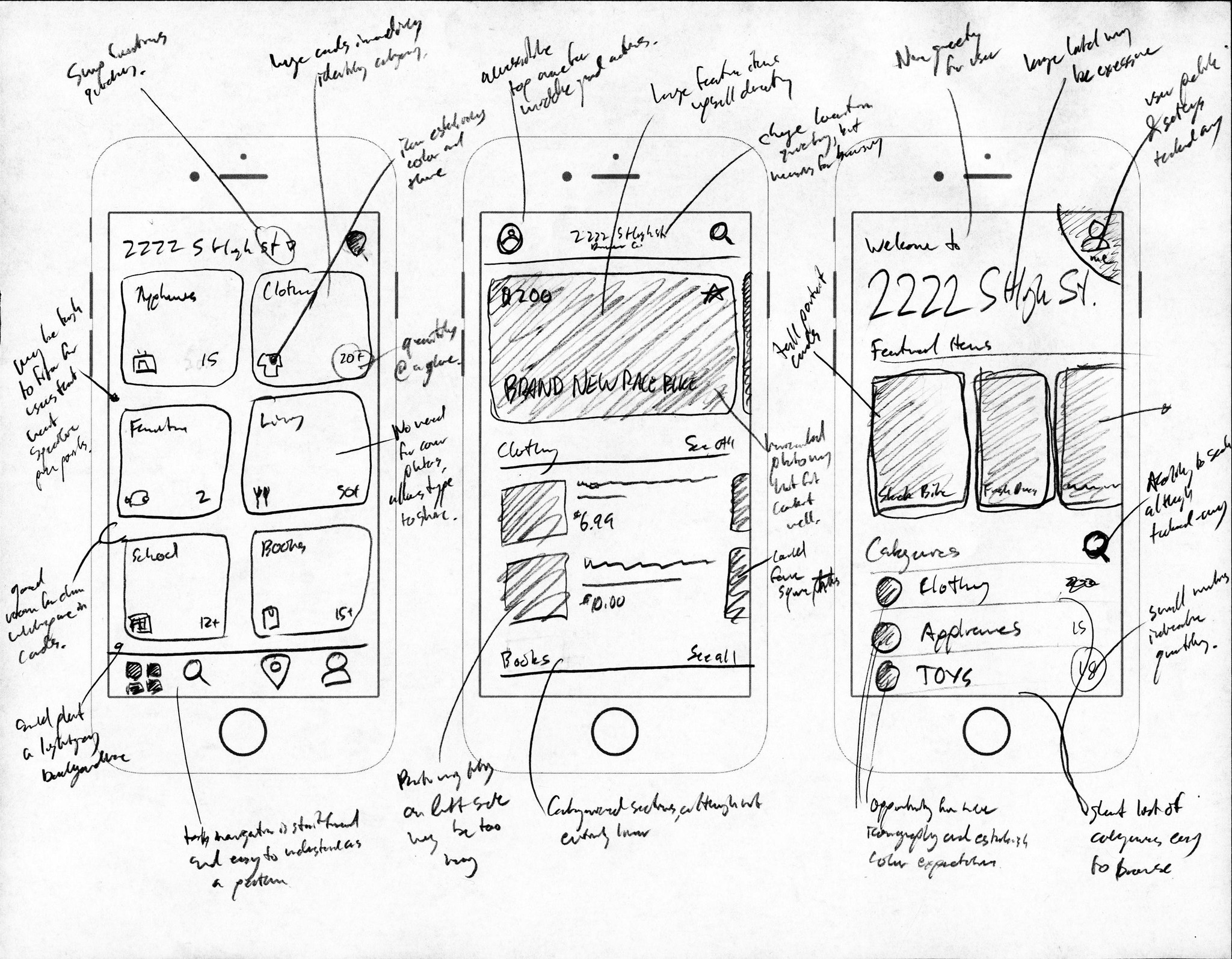
Applying the research above, I used one of my favorite techniques of mashing-up components on a piece of paper to see how they interact as a system. After rapidly sketching a handful of ideas, I go back and annotate what seemed to work and what didn’t, sometimes with an “X” next to a spot that will cause a dead-end in the product or a check to highlight a positive advantage or feature.
It was important to me to isolate the key patterns for the home screen in this process to be confident in the root of the app and how it could expand from there. Choosing patterns that will accomadate the broadest repeating groups and categories while keeping information easily accessible to users helps maintain scaleability.
The buyer and the seller
For the scope of this exploration, I decided to address the two starting steps of both sides: The buyer’s discovery process, and the seller’s posting process.
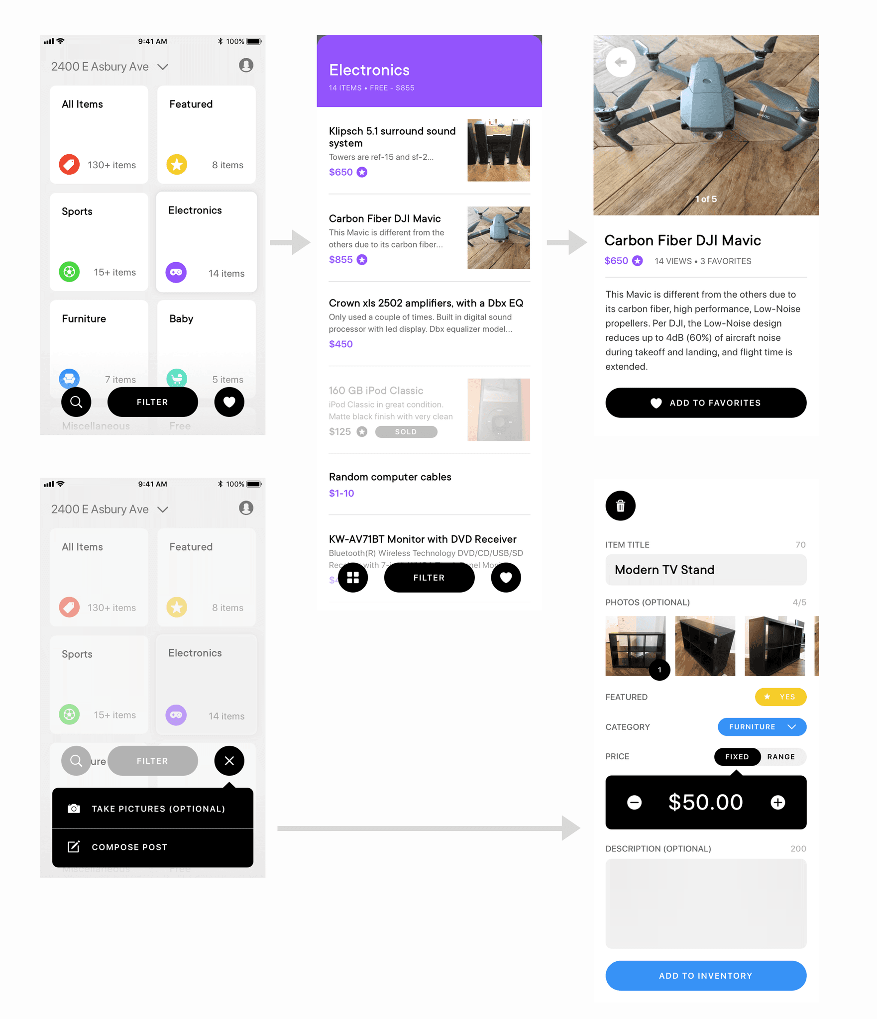
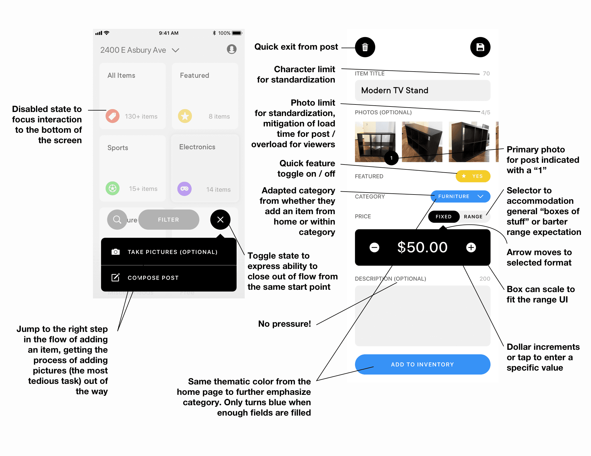
Large cards let the user quickly get a glance of the available categories at this location and just how many items are available, and a simple navigation bar sets the expectation for what options and styles are going to propagate through the interface. Below you’ll find a breakdown of the homepage, two screens from the buyer’s perspective after they tap on a category and then explore an item, and two screens from the seller’s perspective as they go through the first step of adding an item, and then the second step of filling-out item posting details.


Feedback from
three users
On the Home Page:
"What's the whitespace for? I feel like something should be there."
"If I were to look for something to buy, I'd like to get a sense that there is stuff there. Either making the quantity number bigger or using photos of the items may help show that."
On the Add an Item Flow:
"It totally makes sense to have these two buttons [to start]... Feels like it'll be quick."
"This is super intuitive. I REALLY like this. I have to sell a couch pretty soon and it feels like this would be so simple to post with."
"This feels so lightweight that you probably don't even need a save button. Why would you save it when it's just so quick?"
On the Product Page:
"Views and favorites are cool. It feels like this is active and that I should get going if I want this."
Reflections
I used the challenge as way to test out some new visual styles I’ve been looking into, largely with respect to maximizing whitespace, as well an opportunity to experiment with non-tab bar navigation. I’m satisfied with the visual result but, as with every design, there is still room for improvement. After building a prototype and walking some friends through the app on a phone, they actually preferred to see more photos within the first screens of the app. My initial intention was to bucket interests for potential buyers to explore, but it turns out that people prefer large, pretty pictures at first glance. It was interesting that one of my users suggested large, big numbers on the quantities, especially as it was one of the explorations that I had drawn up above. Next steps would be to build out a more functionality to cover the unaddressed features of the visual prototype via more research and wireframing, then run tests with target customers and the wired-up prototype onsite with real photos of items for sale to see how people really would use an app like this.
© Daniel R Farrell 2023 • All rights reserved
The seconds of your life are
T
i
c
k
i
n
g
away
This is a concept Garage Sale app experience that makes it easier for sellers to intelligently inventory their goods, and bargain hunters to find what they're looking for.
Starting with writing
Before diving-in, I like to ideate all of the questions, thoughts, and areas of opportunity to explore with the design.
The best design solves for as many opportunities as possible while laying the foundation for more features to come in the future of the product, so I took the two sides of the prompt and broke them into how might we? (HMW) statements to begin identifying questions I could try to answer in implementation.
On the right side of my notes, you’ll see I wrote out a couple of research points and opportunities to start to wrap my mind around both the problem, as well as potential places of inspiration all the way from vaguely similar to wildly different app interfaces.
I called up a friend to get a fresh perspective on the challenge and to dig into some my assumptions on what would be most important to solve with this app.
I find that I do my most effective work when I can verbally discuss concepts, assumptions, and problems with someone else, especially if they’re not a designer. A quick 15 minute call with my friend Grace brought up some great points from both the buyer and seller perspective, as she reminded me of a couple of key components of a garage sale. First, garage sales are very casual. We discussed how the primary goal of a garage sale is to get rid of stuff, and maybe make a little extra cash off of what a seller is trying to get rid of. “If you wanted to actually make a profit off of something, you’d have better luck on craigslist” Grace told me, drawing the boundary between what a craiglist experience is vs. a real garage sale experience.
Second, the fidelity of an item post needs to cater to just how much work the seller wants to put into selling an item. Some users will be fanatic about every detail, while others will have too much stuff to properly inventory it all. Third, cataloguing every item is extremely tedious, and a lot of times there is varying scope in how someone is trying to sell something. It’s not infrequent to see people just toss things in a box with a price tag on the outside so they’re not taking explicit inventory of it all. Whatever inventory interface I design will have to accommodate for the varying levels of commitment to the process on the seller side.
What do garage sale experts (garage salers?) do to ensure success, and what existing design patterns could help facilitate a marketplace? I did some research into how power-users might already be thinking about organizing their garage sales.
When I go through inspiration I try to point-out features or styles that are functionally or visually interesting and may lend themselves to unique UX patterns that are still intuitive and engaging.
My initial search on Google confirmed most of the assumptions I was making on how people categorize and price things: depending on how dedicated the experts are to a particular niche of items, there are a handful of strategies they use to simplify or highlight items. A lot of the guides talked about more of the physical implementation of the garage sale that may be outside of a strong value-add for an app, but there were still some great points about how people should approach pricing with respect to the expectation of bartering, as well as addressing the cognitive overhead of keeping track of items when the goal is largely to get rid of things that take up space.
On the product side, I put together a Dribbble bucket of visual and UX options that I liked, and placed the options into a large artboard alongside some screenshots of apps I have on my phone to identify patterns I could use. You'll see that I label patterns that could work well for my final solution.
Ultra-low fidelity sketching is a great way to test a variety of patterns against one-another while weighing the weaknesses, opportunities and relationships of certain combos.
Applying the research above, I used one of my favorite techniques of mashing-up components on a piece of paper to see how they interact as a system. After rapidly sketching a handful of ideas, I go back and annotate what seemed to work and what didn’t, sometimes with an “X” next to a spot that will cause a dead-end in the product or a check to highlight a positive advantage or feature.
It was important to me to isolate the key patterns for the home screen in this process to be confident in the root of the app and how it could expand from there. Choosing patterns that will accomadate the broadest repeating groups and categories while keeping information easily accessible to users helps maintain scaleability.
The buyer and the seller
For the scope of this exploration, I decided to address the two starting steps of both sides: The buyer’s discovery process, and the seller’s posting process.
Large cards let the user quickly get a glance of the available categories at this location and just how many items are available, and a simple navigation bar sets the expectation for what options and styles are going to propagate through the interface. Below you’ll find a breakdown of the homepage, two screens from the buyer’s perspective after they tap on a category and then explore an item, and two screens from the seller’s perspective as they go through the first step of adding an item, and then the second step of filling-out item posting details.
Feedback from
three users
On the Home Page:
"What's the whitespace for? I feel like something should be there."
"If I were to look for something to buy, I'd like to get a sense that there is stuff there. Either making the quantity number bigger or using photos of the items may help show that."
On the Add an Item Flow:
"It totally makes sense to have these two buttons [to start]... Feels like it'll be quick."
"This is super intuitive. I REALLY like this. I have to sell a couch pretty soon and it feels like this would be so simple to post with."
"This feels so lightweight that you probably don't even need a save button. Why would you save it when it's just so quick?"
On the Product Page:
"Views and favorites are cool. It feels like this is active and that I should get going if I want this."
Reflections
I used the challenge as way to test out some new visual styles I’ve been looking into, largely with respect to maximizing whitespace, as well an opportunity to experiment with non-tab bar navigation. I’m satisfied with the visual result but, as with every design, there is still room for improvement. After building a prototype and walking some friends through the app on a phone, they actually preferred to see more photos within the first screens of the app. My initial intention was to bucket interests for potential buyers to explore, but it turns out that people prefer large, pretty pictures at first glance. It was interesting that one of my users suggested large, big numbers on the quantities, especially as it was one of the explorations that I had drawn up above. Next steps would be to build out a more functionality to cover the unaddressed features of the visual prototype via more research and wireframing, then run tests with target customers and the wired-up prototype onsite with real photos of items for sale to see how people really would use an app like this.
© Daniel R Farrell 2023 • All rights reserved
The seconds of your life are
T
i
c
k
i
n
g
away