Flowhub
Date
2015
categories
POS, FinTech
role
Product Designer
reading time
collaborators
Flowhub is a startup in Denver, CO that is building digital products for compliance in the cannabis industry. Given that cannabis legislation can pass overnight, we were always on our toes for getting the best product out to our customers ASAP, which meant I had the chance to work on a wide variety of projects.
Point of Sale Cashier
Tens of thousands of transactions go through Flowhub’s POS, but slow internet for the majority of customers made searching for every item a huge pain. Flowhub needed a faster checkout that was as robust as a table view but loaded quicker than search, all while working on laptops and tablets.

The initial design of the cashier page was exactly the same as the inventory section, with a complete table of items that budtenders pick from and add to a customer’s shopping cart. This design was a quite costly on the loading side, given that not all of our customers have blazing fast internet, and that it would take a while to load-in all of the items before a budtender could actually start using the cashier.
This problem was solved by removing the table entirely and installing a simple search box at the top of the screen, but while loading times were significantly reduced, budtenders would have to enter the exact product they were looking for in order to pull-it-up and add it to a customer’s cart. Having to search for the exact product made for a pretty painful UX when a budtender screws up a specific SKU or misses a letter.
The original design
In an effort to conserve load time, the primary screen on the POS was a blank page with a lonely search bar in the upper corner. Two types of customers visit a dispensary: The regular, and the tourist. One knows exactly what they want, and the other wants to explore. Budtenders needed prompts and specials to guide the sale to tourists, and we thought this opening screen would be a great place for that.
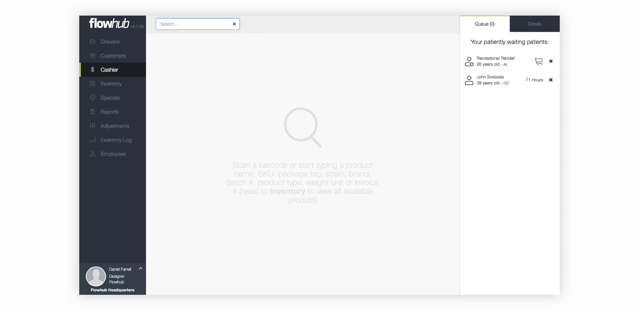
Regular customers know exactly what they are looking for when they walk through the doors of a dispensary, making the entire purchasing process pretty quick and straightforward. Tourist customers are often people who have little to no experience with cannabis products and have tons of questions regarding their potential cannabis purchase. The simple search box design of the cashier was great for helping the regular customers, but didn’t offer any prompts or up-sell opportunities for when it came to the probing tourist customer.
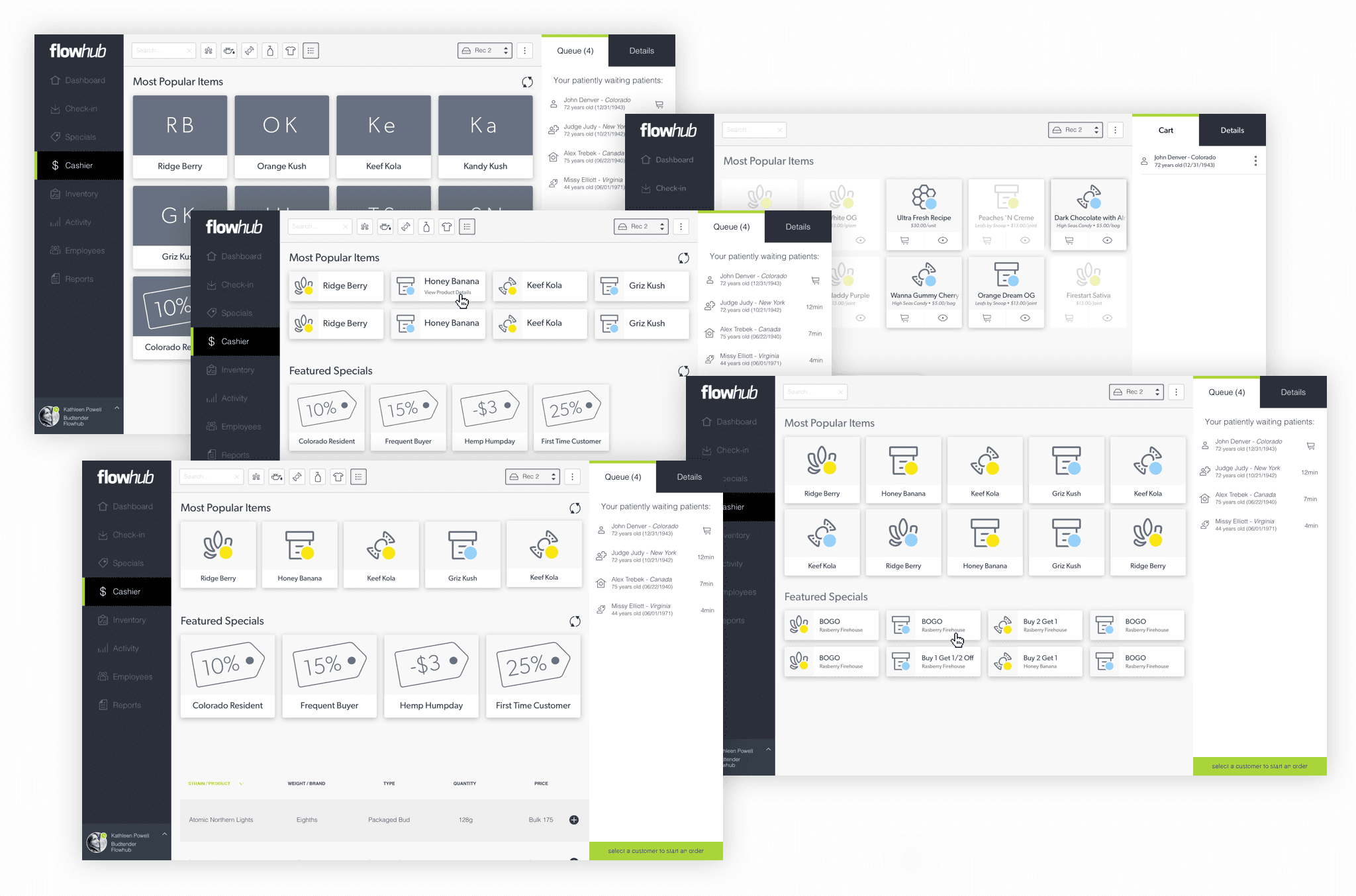
I was tasked with totally revamping the cashier experience to make it easy for a budtender to sell to both groups. I began by assessing the limitations of the current design and outlining the goals of my redesign. Usability across tablet and desktop, emphasis on up-sell opportunities, transaction speed, and distinctness of products became the main drivers for this redesign, so with those in mind I started developing mockups.
Highly visual cards offered a generous amount of click or tap space for both desktop and mobile, and translated primary product information for tourist customers.
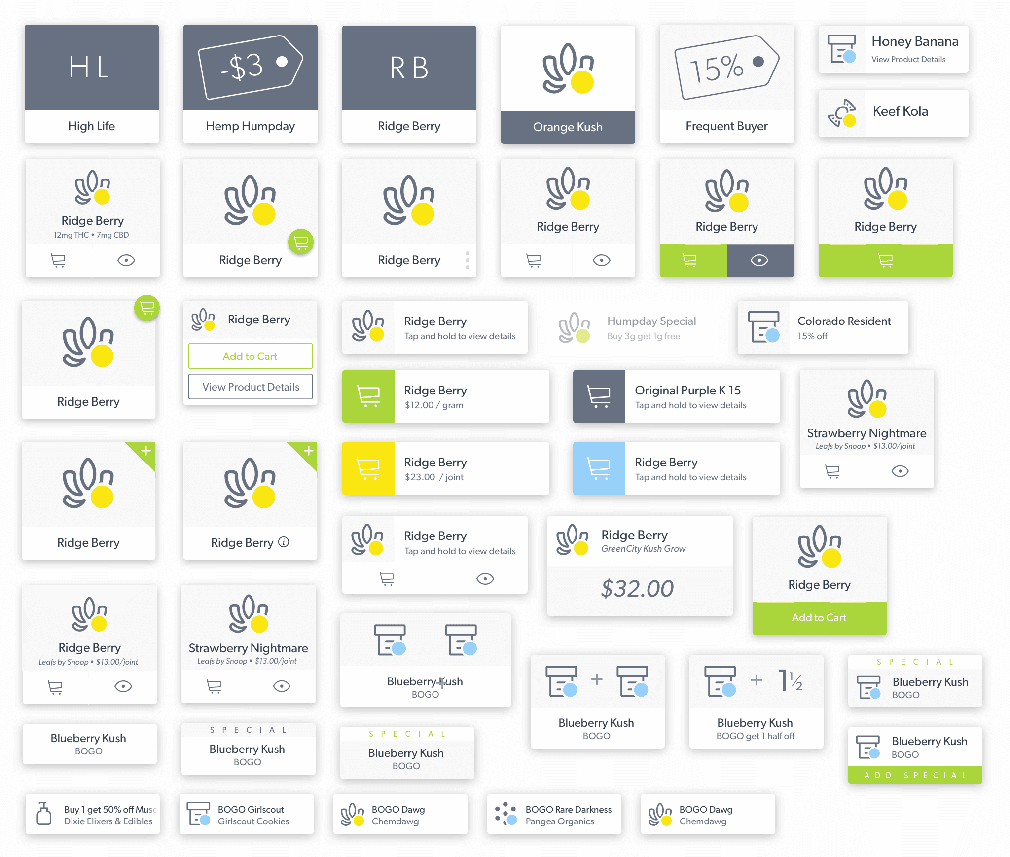
Having conducted research into other digital point of sale systems, it was apparent that cards were the preferred design pattern for the main screen. I tried a couple of methods of presenting the products with various labels and icons, but a budtender needs to know quite a lot more than a regular POS card may show in order to make even a mildly appropriate recommendation. Note how many characteristics a cannabis product can have as points of up-selling to a customer: what type of product it is, how much it costs, what units of weight it is sold by, whether it’s available for medical or recreational sale, what brand it is, what type of blend it is, how much CBD and THC is in it, etc.
One of the challenges of this cashier was packing as much of this information into cards while maintaining legibility and clickability. I prototyped touch and hover-states for the cards in HTML and CSS, but the developers expressed concerns about the variety of browsers and devices they’d have to develop this for in a short time period, as well as the usability when it came to touching where information would be displayed on the cards, thereby obstructing the user’s view on touch devices. You can see the evolution of packing information into cards with some of my early component trials below:
The final design combined interactivity on desktop with the ability for store owners to reorganize products. If there was a product they were looking to upsell, it was now possible to put it front-and-center for Budtenders to see at first glance.
Micro icons and accessibility
On the right side of the POS there is a feed of activity that comes through the store. Users tend to scroll quickly through the feed looking for a specific activity, so I was tasked with designing clear, distinct, and intuitive indicators. Because users would scan through items quickly, I optimized for accessibility and borrowed techniques from designing for poor vision and color blindness.

The icons we were using for products and pages could only fit in areas so small, and they weren’t particularly distinct as you scroll through them quickly, as they were all the same line width, size, and color so we decided to introduce a new micro-icon system. These icons were to be legible at small sizes, and were to be paired with bright colored bases to develop a heuristic of familiarity for the Budtenders to quickly identify what they are looking for. Along those lines as well, I tried to make the icons and their base colors distinct enough to be identified by someone who was colorblind or someone with poor eyesight.
One of the crazy things I learned while working on these icons was how all of the classical rules of maintaining line-width in iconography go right out of the window once you’re working at micro scale. Most of the time you can keep the same line-width, but often times I’d be pushing fractions of a pixel to make sure clearance between two icon segments was wide enough. Selecting base colors for the icons was an interesting task as well, given that there was such a wide variety of activities that could show up in a feed. For the non-heuristic color selections (heuristic like green for add, red for delete) I tried to match colors that had similar hues like green, turquoise, and blue with distinct icons of events that would likely occur in different time intervals, so they wouldn’t appear next to each other very often.
Redesigning information tables
Homogenous typography, low contrast, and a lack of hierarchical organization made browsing product details arduous and time consuming.

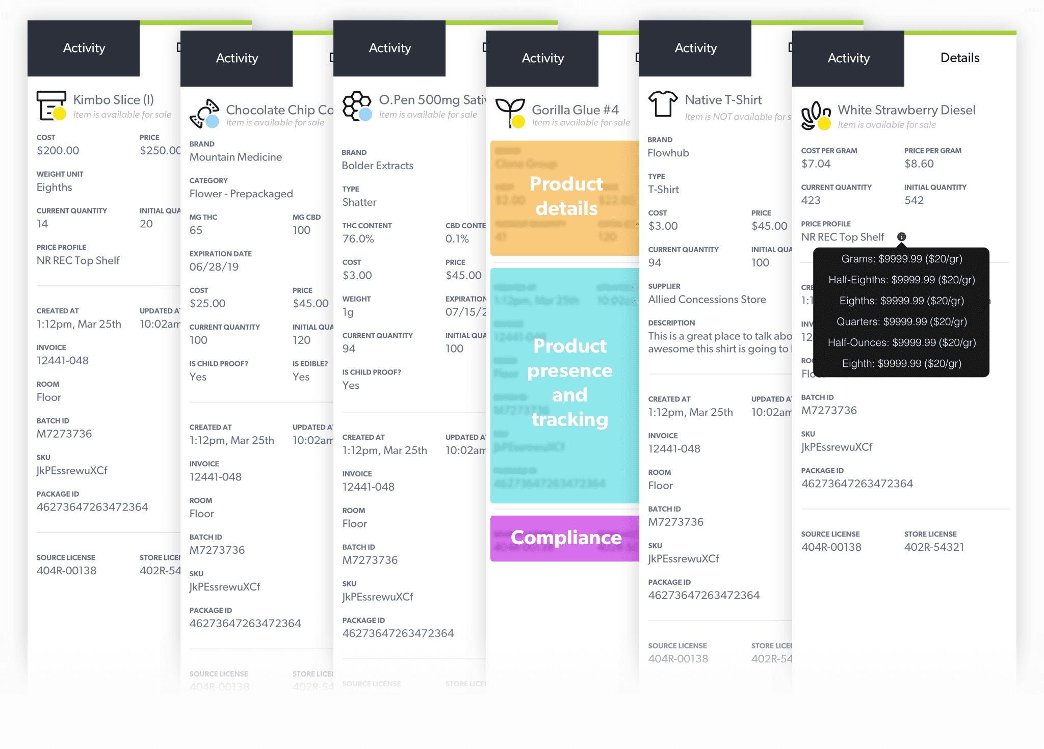
On the right side of every point of sale screen there is a column controlled by two tabs. This column displays details about selected items in the center-view, enabling users to do a deep-dive into what happens in the dispensary. The design at the time was a condensed table with the label on the left side and the content on the right. From a pure functionality standpoint, this covered about 80% of the cases of information that it would present, but the other 20% rendered it almost unusable. Sometimes labels would extend far into the right side of the table and have to end in an ellipses (…) before the user new what it was describing, and vice-versa for the content on the opposite side of the table. Given that these detailed views were supposed to denote compliance information, they were definitely due for a UI/UX upgrade.
My design started with maximizing the space given in the column itself. I pushed the label margins up to 12px of the main container, and consolidated the appropriate characteristics into subcategories to use across all of the detail columns for the products and pages. It’s worth mentioning that the ease-of-use of Flowhub as a point of sale system for the cannabis industry greatly reduces the stress of being audited by the federal government at any random time on any given day. The ease of use of this detailed view during an audit continues to be a major selling point for all of Flowhub’s customers that use the POS application.
Organizing consistent themes of information into three standard sections helped Budtenders find information they needed easily regardless of the type of product they are looking at.
© Daniel R Farrell 2023 • All rights reserved
The seconds of your life are
T
i
c
k
i
n
g
away
Flowhub is a startup in Denver, CO that is building digital products for compliance in the cannabis industry. Given that cannabis legislation can pass overnight, we were always on our toes for getting the best product out to our customers ASAP, which meant I had the chance to work on a wide variety of projects.
Point of Sale Cashier
Tens of thousands of transactions go through Flowhub’s POS, but slow internet for the majority of customers made searching for every item a huge pain. Flowhub needed a faster checkout that was as robust as a table view but loaded quicker than search, all while working on laptops and tablets.
The initial design of the cashier page was exactly the same as the inventory section, with a complete table of items that budtenders pick from and add to a customer’s shopping cart. This design was a quite costly on the loading side, given that not all of our customers have blazing fast internet, and that it would take a while to load-in all of the items before a budtender could actually start using the cashier.
This problem was solved by removing the table entirely and installing a simple search box at the top of the screen, but while loading times were significantly reduced, budtenders would have to enter the exact product they were looking for in order to pull-it-up and add it to a customer’s cart. Having to search for the exact product made for a pretty painful UX when a budtender screws up a specific SKU or misses a letter.
The original design
In an effort to conserve load time, the primary screen on the POS was a blank page with a lonely search bar in the upper corner. Two types of customers visit a dispensary: The regular, and the tourist. One knows exactly what they want, and the other wants to explore. Budtenders needed prompts and specials to guide the sale to tourists, and we thought this opening screen would be a great place for that.
Regular customers know exactly what they are looking for when they walk through the doors of a dispensary, making the entire purchasing process pretty quick and straightforward. Tourist customers are often people who have little to no experience with cannabis products and have tons of questions regarding their potential cannabis purchase. The simple search box design of the cashier was great for helping the regular customers, but didn’t offer any prompts or up-sell opportunities for when it came to the probing tourist customer.
I was tasked with totally revamping the cashier experience to make it easy for a budtender to sell to both groups. I began by assessing the limitations of the current design and outlining the goals of my redesign. Usability across tablet and desktop, emphasis on up-sell opportunities, transaction speed, and distinctness of products became the main drivers for this redesign, so with those in mind I started developing mockups.
Highly visual cards offered a generous amount of click or tap space for both desktop and mobile, and translated primary product information for tourist customers.
Having conducted research into other digital point of sale systems, it was apparent that cards were the preferred design pattern for the main screen. I tried a couple of methods of presenting the products with various labels and icons, but a budtender needs to know quite a lot more than a regular POS card may show in order to make even a mildly appropriate recommendation. Note how many characteristics a cannabis product can have as points of up-selling to a customer: what type of product it is, how much it costs, what units of weight it is sold by, whether it’s available for medical or recreational sale, what brand it is, what type of blend it is, how much CBD and THC is in it, etc.
One of the challenges of this cashier was packing as much of this information into cards while maintaining legibility and clickability. I prototyped touch and hover-states for the cards in HTML and CSS, but the developers expressed concerns about the variety of browsers and devices they’d have to develop this for in a short time period, as well as the usability when it came to touching where information would be displayed on the cards, thereby obstructing the user’s view on touch devices. You can see the evolution of packing information into cards with some of my early component trials below:
The final design combined interactivity on desktop with the ability for store owners to reorganize products. If there was a product they were looking to upsell, it was now possible to put it front-and-center for Budtenders to see at first glance.
Micro icons and accessibility
On the right side of the POS there is a feed of activity that comes through the store. Users tend to scroll quickly through the feed looking for a specific activity, so I was tasked with designing clear, distinct, and intuitive indicators. Because users would scan through items quickly, I optimized for accessibility and borrowed techniques from designing for poor vision and color blindness.
The icons we were using for products and pages could only fit in areas so small, and they weren’t particularly distinct as you scroll through them quickly, as they were all the same line width, size, and color so we decided to introduce a new micro-icon system. These icons were to be legible at small sizes, and were to be paired with bright colored bases to develop a heuristic of familiarity for the Budtenders to quickly identify what they are looking for. Along those lines as well, I tried to make the icons and their base colors distinct enough to be identified by someone who was colorblind or someone with poor eyesight.
One of the crazy things I learned while working on these icons was how all of the classical rules of maintaining line-width in iconography go right out of the window once you’re working at micro scale. Most of the time you can keep the same line-width, but often times I’d be pushing fractions of a pixel to make sure clearance between two icon segments was wide enough. Selecting base colors for the icons was an interesting task as well, given that there was such a wide variety of activities that could show up in a feed. For the non-heuristic color selections (heuristic like green for add, red for delete) I tried to match colors that had similar hues like green, turquoise, and blue with distinct icons of events that would likely occur in different time intervals, so they wouldn’t appear next to each other very often.
Redesigning information tables
Homogenous typography, low contrast, and a lack of hierarchical organization made browsing product details arduous and time consuming.
On the right side of every point of sale screen there is a column controlled by two tabs. This column displays details about selected items in the center-view, enabling users to do a deep-dive into what happens in the dispensary. The design at the time was a condensed table with the label on the left side and the content on the right. From a pure functionality standpoint, this covered about 80% of the cases of information that it would present, but the other 20% rendered it almost unusable. Sometimes labels would extend far into the right side of the table and have to end in an ellipses (…) before the user new what it was describing, and vice-versa for the content on the opposite side of the table. Given that these detailed views were supposed to denote compliance information, they were definitely due for a UI/UX upgrade.
My design started with maximizing the space given in the column itself. I pushed the label margins up to 12px of the main container, and consolidated the appropriate characteristics into subcategories to use across all of the detail columns for the products and pages. It’s worth mentioning that the ease-of-use of Flowhub as a point of sale system for the cannabis industry greatly reduces the stress of being audited by the federal government at any random time on any given day. The ease of use of this detailed view during an audit continues to be a major selling point for all of Flowhub’s customers that use the POS application.
Organizing consistent themes of information into three standard sections helped Budtenders find information they needed easily regardless of the type of product they are looking at.
© Daniel R Farrell 2023 • All rights reserved
The seconds of your life are
T
i
c
k
i
n
g
away