DIMO – PODS Design System
Date
2022
categories
Product Design
role
Product Design Manager
reading time
collaborators
DIMO is a user-owned connected vehicle platform. It allows drivers to access next-generation mobility apps and earn $DIMO for sharing data from their cars.
As DIMO recently went through a rebrand and we were in the process of rearchitecting the main consumer app, we had an opportunity to modernize our design system.
I project managed and contributed to the build out of a reference file for all of DIMO's core components over the course of 10 weeks. The team was made up of the lead designer, our contract product designer, and myself, and we released the first version on Figma to share with the design community.
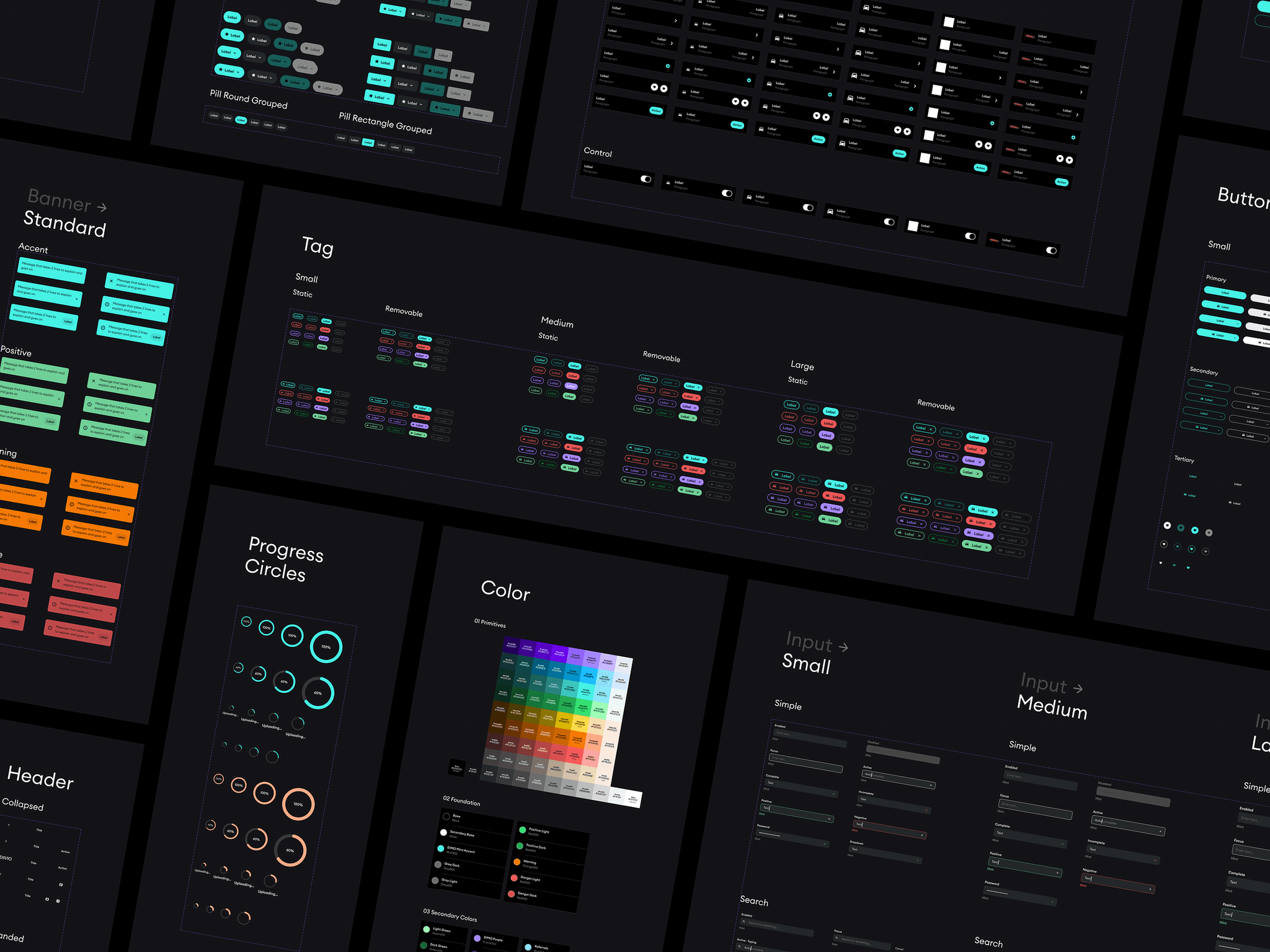
File structure
Taking inspiration from Uber and Lyft's design systems, we started with a single-page file structure that cascaded base components towards more complex components from left to right.
File structure
Taking inspiration from Uber and Lyft's design systems, we started with a single-page file structure that cascaded base components towards more complex components from left to right.
File structure
Taking inspiration from Uber and Lyft's design systems, we started with a single-page file structure that cascaded base components towards more complex components from left to right.
Colors
Typography
Lists
Inputs
Top Nav
Trays, Cards,
Widgets
Alerts,
Notifications
Buttons, Pills, Markers, Badges
Progress indicators
Progress indicators
Tags
Figma organizing
Tabs, Tooltips
Tabs, Tooltips
Bottom Nav
Bottom Nav
Cars, System, Misc.
Cars, System, Misc.
Simplest
Most complex
Most used
Most used
Least used
We arranged the sections in order of how the primitive parts (typoography, buttons, pills, etc.) would come together in the more aggregate components (lists, inputs, navigation, cards, etc.).
This was especially useful because occasionally if we needed to update a component like a button, the change would propagate throughout the full system to the right, and it was easy to troubleshoot or modify any structural components as we designed the system.
A powerful palette
DIMO's rebrand produced only a handful of hues to work with, including a fresh mint color, a light tan, and dark tones. While the palette was a great start, we needed to expand the color system to scale across brand and product for illustrations and other unique color applications.
Drag palette to explore hues
Purple300
#A487FF
DIMO Purple
Blue200
#8CD0FF
Referrals
Mint800
#052C29
Mint700
#0E4742
Mint600
#17645D
Mint500
#22847C
Mint400
#38C8BD
Mint300
#46F1E4
DIMO Mint
Green300
#36DF71
Positive
Green200
#9CFCB4
Yellow300
#FED949
Caution
Orange300
#F57A00
Warning
Red300
#F85454
Danger
Tan100
#FAEBDD
Paper
Black
#000000
DIMO Black
White
#FFFFFF
DIMO White
Taking inspiration from Lyft's effort to simplify their colors back in 2018, I wanted to use this opportunity to establish a wide palette and make a numbering system that would be helpful for identifying colors.
Using Darian Rosebrook's Accessible Color Palettes plugin, I rendered a number of hue curves for each color with matching contrasts to create a cohesive palette. I relied on plenty of testing to render and uncover color combinations in our design system that would scale, but also would match our existing brand.
Two results came from this exploration:
We landed on a palette that maintained the brand in both light and dark, with an emphasis on high contrast colors on a dark background.
We maintained a consistent numbering system where colors from 800 to 500 would contrast on white text, and colors from 400 to 100 would contrast well with dark text.
Pods community file
We released Pods to equip designers and developers with a system they could use to jump start their design process and to borrow from much of the learnings and decision making the DIMO design team already made when it came to building product. Over 1,100 designers have downloaded it since we launched it, and you can explore the latest version below. Tap on "Pods: DIMO Design System" on the bottom of the view to open the file.
Further improvements
Figma added Variables and AutoLayout improvements that fixed some of the gaps we solved with our own hacks. To bring Pods up to date, I would amend our hacks to align with the latest Figma features.
Label
Paragraph
Label
Paragraph
Label
Paragraph
Label
Paragraph
Label
Paragraph
Label
Paragraph
We used a spacer component (animating above) for many of our components to standardize gaps between groups, which is a feature that Figma has since introduced with Variables. More importantly, Figma had also introduced a variant functionality that heavily simplified the need to present every instance of a component on a style sheet.
For the initial release, we decided to emulate the usual design system layout that most systems have (where all instances are visible) as it can be difficult to understand how everything comes together when variants are tucked away in a drop-down menu (as is the case when browsing variants from the right toolbar).
To improve on the file we produced, it would be great to introduce a guide on the variants, still showcase how they would be displayed, but have a single master-component that could act as the core of all of the variant use cases. That way we could still have the sheet represent all of the possibilities of the component for developers, while giving the designer one component to select for their file.
© Daniel R Farrell 2023 • All rights reserved
The seconds of your life are
T
i
c
k
i
n
g
away